“Design is the silent ambassador of your brand.”
Though an unlikely skill for a scientist, I’ve found that design is an integral part of communication in the digital age. Regardless of the message you’re getting out, the quality, design, and attention to detail of your medium speaks before a single word is read or uttered.
During graduate school, I worked with small businesses, nonprofits, and organizations across the Gunnison-Crested Butte area to meet their advertising and outreach needs, but these skills have also proven essential in my work as a scientist. Examples of my work are below. Please email me for graphic design inquiries!
Working with another artist’s work, in this case professional photography, challenges me to consider the original image’s focal point and create a design that doesn’t visually clash while honoring the other artist’s work. In a way, it’s a collaboration!
This photographer loved the proof we sent him of my design, and even asked us for printed copies of the flyer!
A flyer I designed to highlight a yoga studio’s mindfulness offerings. The feel of the poster, muted and calming, is suggestive of the mental benefits of meditation. The photo is of one of the studio’s instructors.
This yoga teacher, Margaret, asked if I could make her a promotional flyer that captured the spirit of her Body Maintenance class, especially the fact that she and her husband, Mike, saw their class as a co-ed offering. So I presented her with this fun construction-themed design, which she loved!
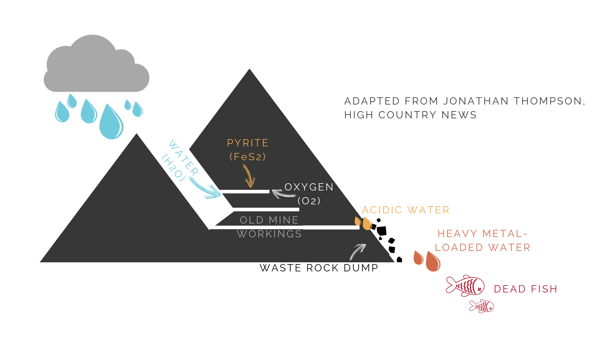
An example of how my graphic design work serves me in science communication. This is a figure I created for my master’s thesis illustrating the mechanism for acid mine drainage.
A newspaper ad I created to attract potential sponsors for my client.
The bird in the title is a nod to Dr. Drew Lanham, the keynote speaker, who is an ornithologist. The image of Bears Ears along the bottom alludes to Regina Lopez Whiteskunk’s activist work protecting the monument; she was a featured panelist at this event.
My client asked me to incorporate a few previous poster designs into this informational flyer so artists would know what kind of work had been chosen in the past. So I featured a few in the white space, and I created the header background from old poster designs!
An example of how I apply graphic design to science communication, this is an informational brochure I created for a nonprofit based out of Creede, Colorado for them to place in tourist-frequented locations to raise the organization’s profile. I created both the content and the design of this brochure.
I often create social media posts that match my print ad or flyer designs for cross-platform advertising. In this case, I adapted the print ad on the left into a social media image that was bright, engaging, and got the point across in few words.


